Channel Home Screen
Level of Permission (Roles)
Available to Tenant, Super Admin, Admin and Content Manager users.
Overview
The Home Screen is the initial interface that users come across upon logging in to the platform or accessing an Organization that is Public.
In this section, the Home Screen can be customized and branded according to the specific needs and preferences of the Organization, including customizable lists of content that improve user engagement and navigation, by presenting the most relevant information and features to the user in an easy-to-access manner.
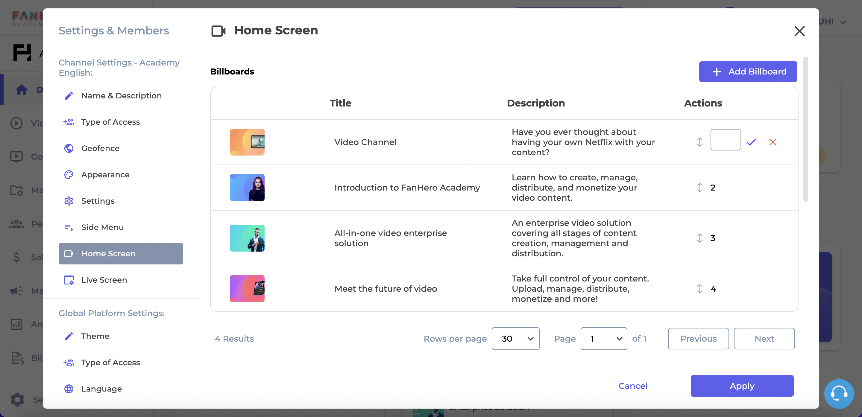
Billboard
The billboard section is a prominent and visually appealing area within the application where featured content is highlighted. It serves as a premium area to showcase recommended content to users and it is a valuable tool for promoting content, driving user engagement, and conveying important messages.
This section allows administrative users to create, edit, delete and organize billboards.
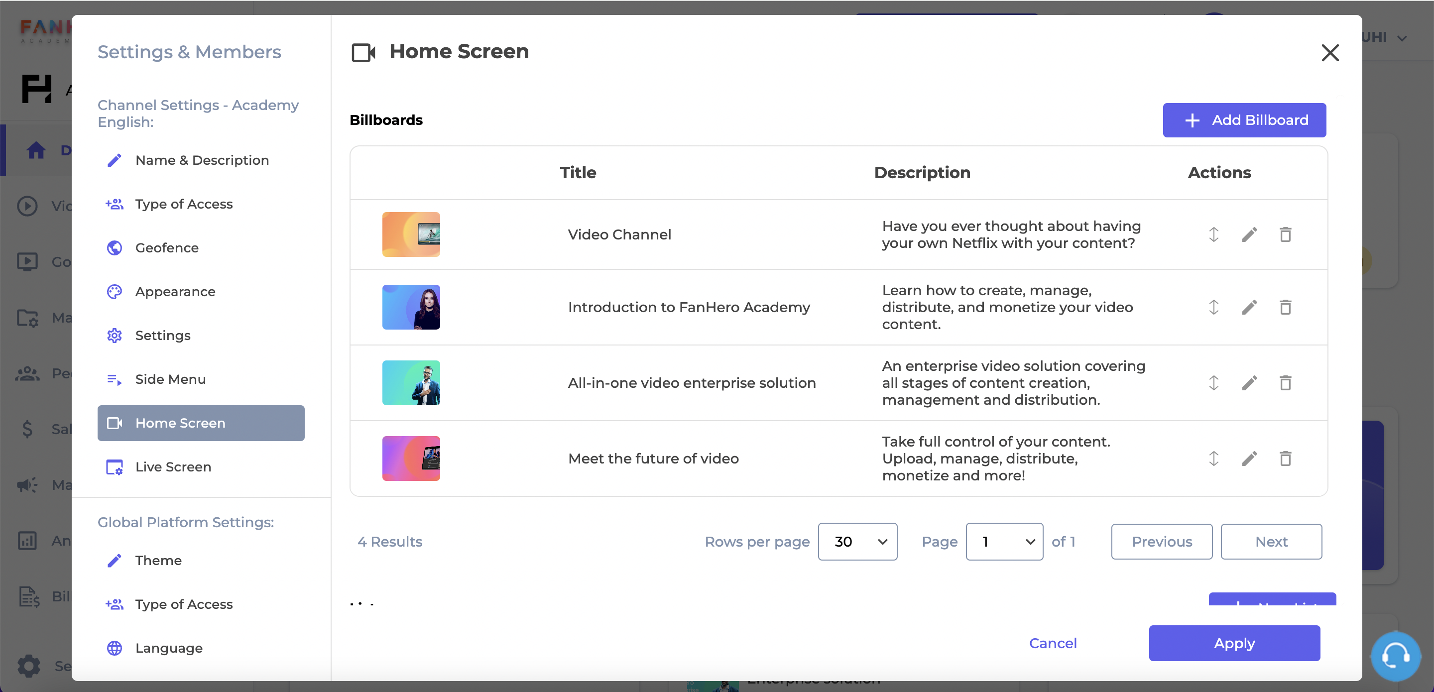
The Home Screen Customization
| Item | Description |
|---|---|
| + Add Billboard | Add Billboard button. Clicking on it will take you to the "New Billboard" screen. |
| Thumbnail | Billboard image. |
| Title | Billboard title. |
| Description | Billboard description. |
| Order | Reordering icons. |
| Edit | Edit icon. Clicking on it will take you to the "Edit Billboard" screen. |
| Delete | Delete icon. |
Create a Billboard
To create a new Billboard, click on the + Add Billboard button.
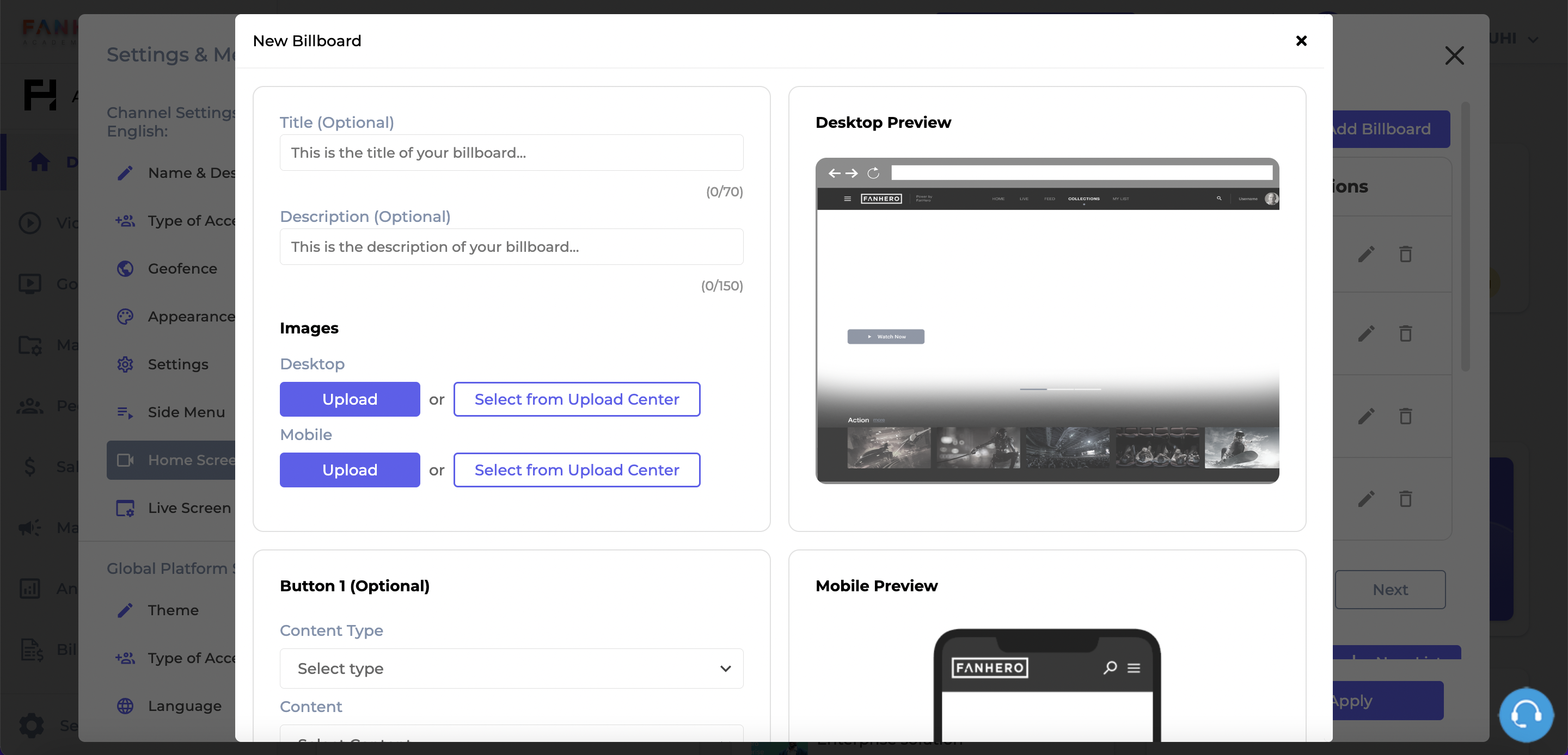
The Create Billboard Screen
Item | Description |
|---|---|
Title | The title of the billboard. |
Description | The description of the billboard. |
Desktop Image | The desktop image of the billboard (shown in resolutions greater than 832px). The ideal image is the one that helps with the text readability. The text is aligned to the bottom left and occupies 60% of the screen size. The image can be uploaded from your computer or from the Upload Center. Required field. |
Mobile Image | The mobile image of the billboard (shown in resolutions smaller than 832px). The ideal image is the one that helps with the text readability. The text is centered and aligned to the bottom. The image can be uploaded from your computer or from the Upload Center. Required field. |
Preview | Preview of images for both desktop and mobile. |
Cancel | Cancel button. Clicking on it will take you back to the Home Customization page. |
Create | Create button. If all validation criteria is met, the new billboard is created. |
Billboards may include clear and prominent call-to-action buttons that prompt users to take specific actions. For example, a "Watch Now" button that can direct users to relevant sections (a post or a category) or external websites.
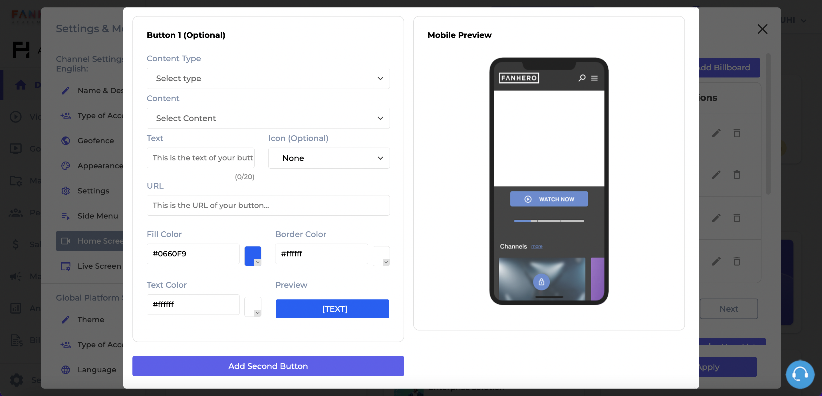
Item | Description |
|---|---|
Content Type | A dropdown field: post, category or other (external link). Optional field. |
Content | This field will depend on what was chosen in the Content Type field.
Required field if Content Type is selected. |
Text | The text of the button. Optional field, between 1 and 20 characters. |
Icon | The icon of the button. A dropdown list of available icons is displayed. Required field if Content Type is selected. |
URL |
|
Background Color | The background color of the button. You may select the color from the color palette or by adding a HEX or RGB color code. Required field if Content Type is selected. |
Border Color | The border color of the button. You may select the color from the color palette or by adding a HEX or RGB color code. Required field if Content Type is selected. |
Text Color | The text color of the button. You may select the color from the color palette or by adding a HEX or RGB color code. Required field if Content Type is selected. |
By clicking on the "Add Second Button" button, all fields above will be displayed again, this time for "Button 2".
Edit a Billboard
To edit an existing Billboard, click on the pencil (edit) icon next to the Billboard you want to make changes. This action will take you to the Edit Billboard screen.
All fields are editable and follow the same requirements as the Create Billboard section above.
Delete a Billboard
There are two ways to delete a billboard: from the list view, by clicking on the trash icon; or from the Edit Billboard screen by clicking on the Delete button.
This action requires a confirmation: clicking on the X button will dismiss the pop up and the billboard will not be deleted. Clicking on Confirm will dismiss the pop up, the billboard will be deleted and a confirmation message will be displayed.
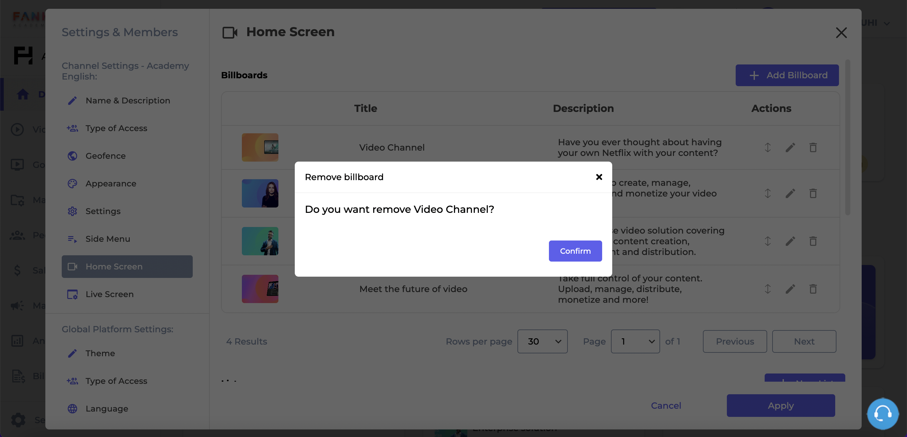
Remove billboard confirmation pop up
Reorder Billboards
The content in the billboard section changes every 5 seconds, to provide fresh and varied content for users. This helps to maintain user interest.
Administrative users can choose in which order the billboards will be presented to the user by clicking the up down arrow next to a specific billboard and entering the new position. You must click on the purple checkmark to save the new position.
Reordering Billboards
Carousels (Lists of Content)
Lists present content in a horizontal format, following a sequential order. Lists may include text, images, and/or video posts, and are often used to organize content into a specific order. The order, name and content of the list can be created and managed through this section.
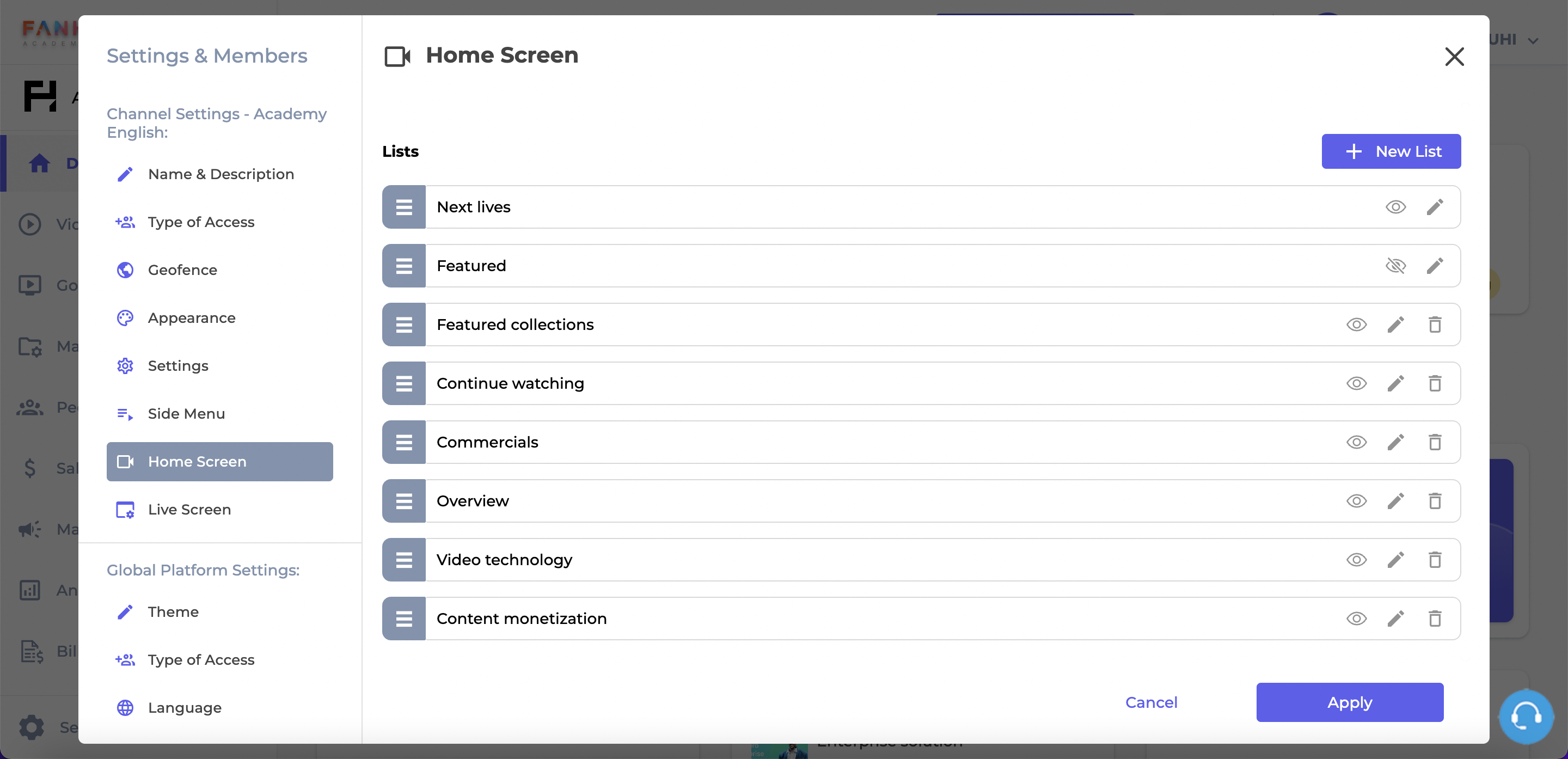
The Carousels section
There are 2 types of lists: pre-defined lists and customized lists:
Pre-defined Lists
The pre-defined lists are default lists of the platform:
-
Live: a list that contains all Live and Upcoming live events ordered by scheduled date (oldest to newest).
-
Featured Posts: a list of posts that are marked as "Featured", ordered by featured date (the date the post was marked as Featured) - from newest to oldest.
-
Featured Categories: a list of all collections marked as "Featured", ordered by featured date (newest to oldest).
-
Continue Watching: a list of video posts a user has previously started but not yet finished.
Pre-defined lists cannot be deleted, but they can be hidden. Administrative users may chose whether or not a specific list will be displayed for users by clicking on the eye icon. Crossed out eye icons mean the list will not be displayed to users.
Customized Lists
Customized lists of content are lists that are tailored to the specific needs of the Organization and they are manually created in this section.
Create a List
New lists of content are created based on the platform's tagging system, where content items are assigned one or more tags.https://docs.fanhero.com/docs/tags These tags could be keywords, genres, topics, or any other relevant descriptors that help classify and organize the content.
To create a new list of content, click on the New List button.
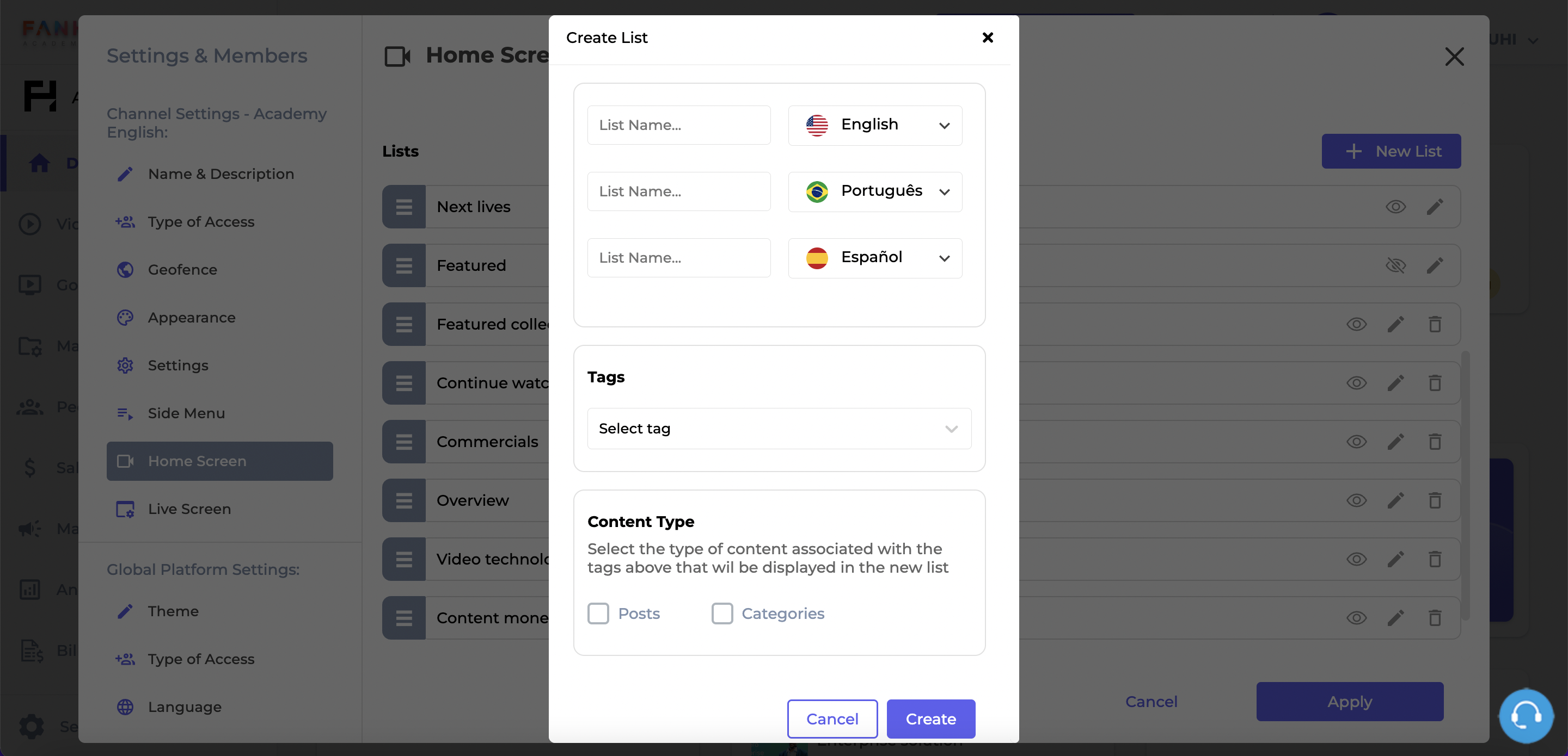
The Create List screen
Item | Description |
|---|---|
List Name | The name of the list in English. |
List Name | The name of the list in Portuguese (Brazil). |
List Name | The name of the list in Spanish. |
Tags | A dropdown with a list of all available tags is displayed. |
Content Type | Posts and Categories. |
Cancel | Cancel button. Clicking on it will take you back to the Home Customization page. |
Create | Create button. If all validation criteria is met, the new list is created. |
Edit a List
To edit an existing list, click on the pencil (edit) icon. This action will take you to the Edit List screen.
All fields are editable and follow the same requirements as the New List screen.
Delete Existing List
There are two ways to delete a list: from the list view, by clicking on the trash icon; or from the Edit List screen by clicking on the Delete button.
This action requires a confirmation: clicking on the X button will dismiss the pop up and the list will not be deleted. Clicking on Confirm will dismiss the pop up, the list will be deleted and a confirmation message will be displayed.
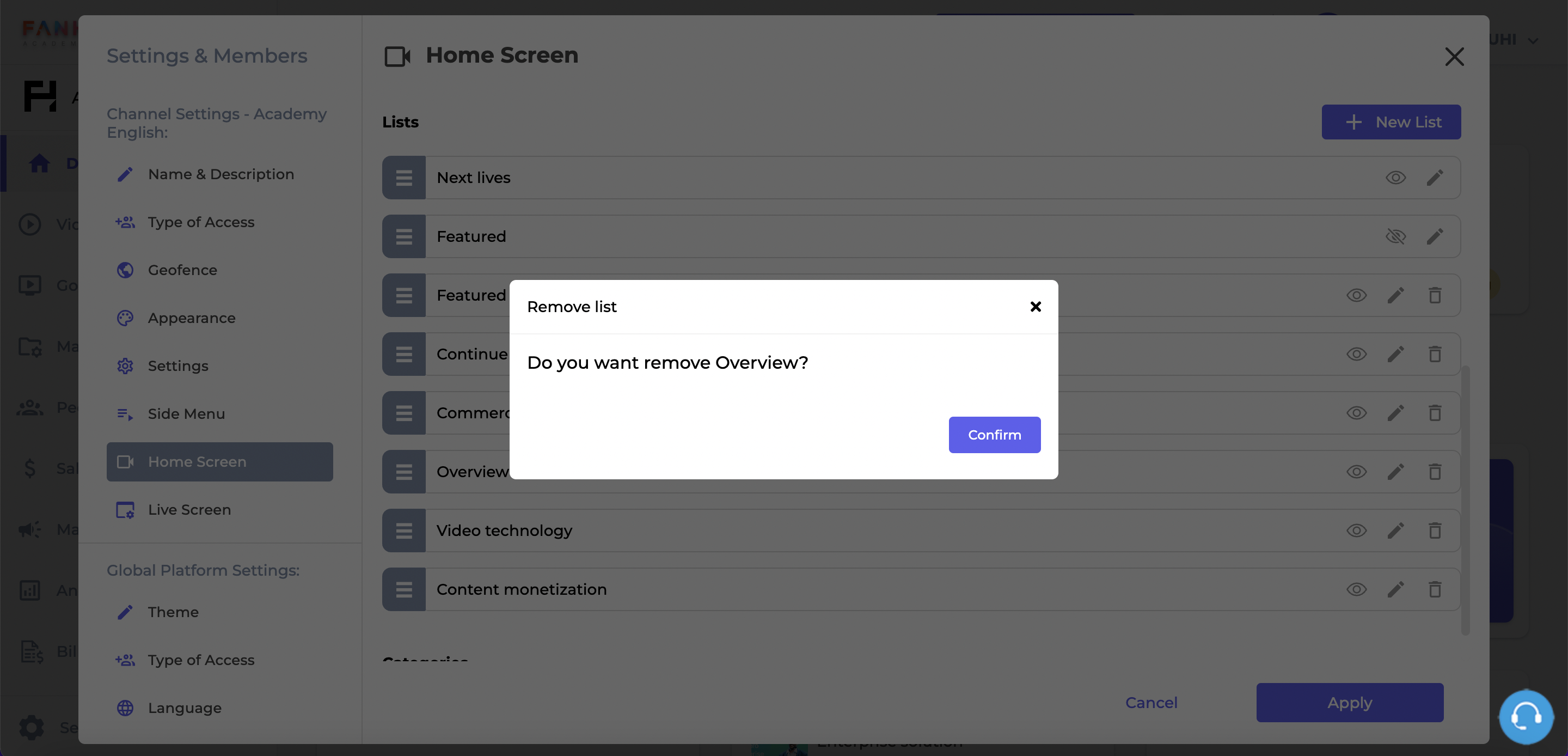
Delete a List confirmation
Reorder Lists
The order of the lists can be changed by clicking on the gray area and dragging it to the new position. Click on the Apply button to make the changes available to users.
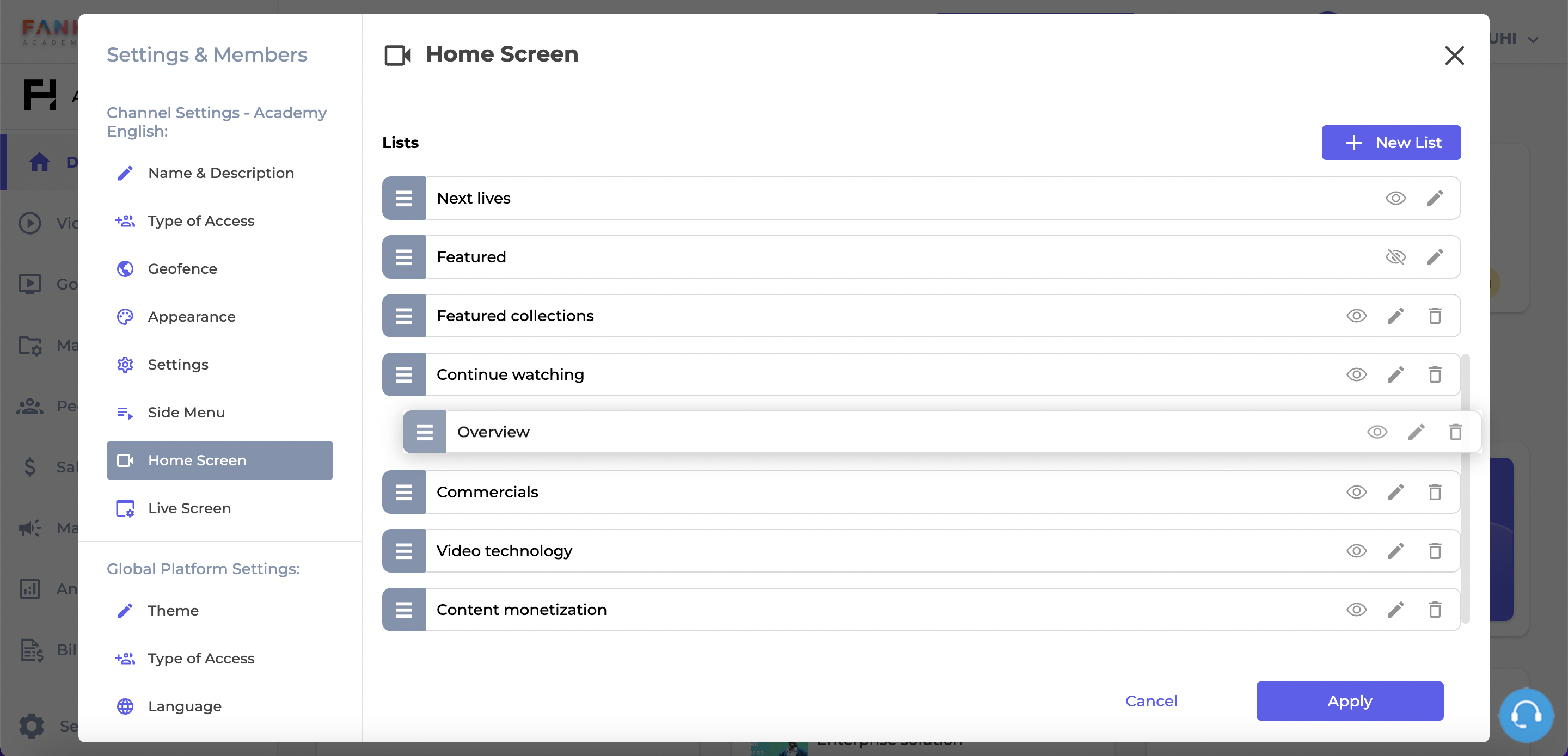
Reordering Lists
Name of Lists
The name of the lists are also customizable, in each language available in the platform. To change the name of a list, click on the pencil icon, add a new name and click Update.
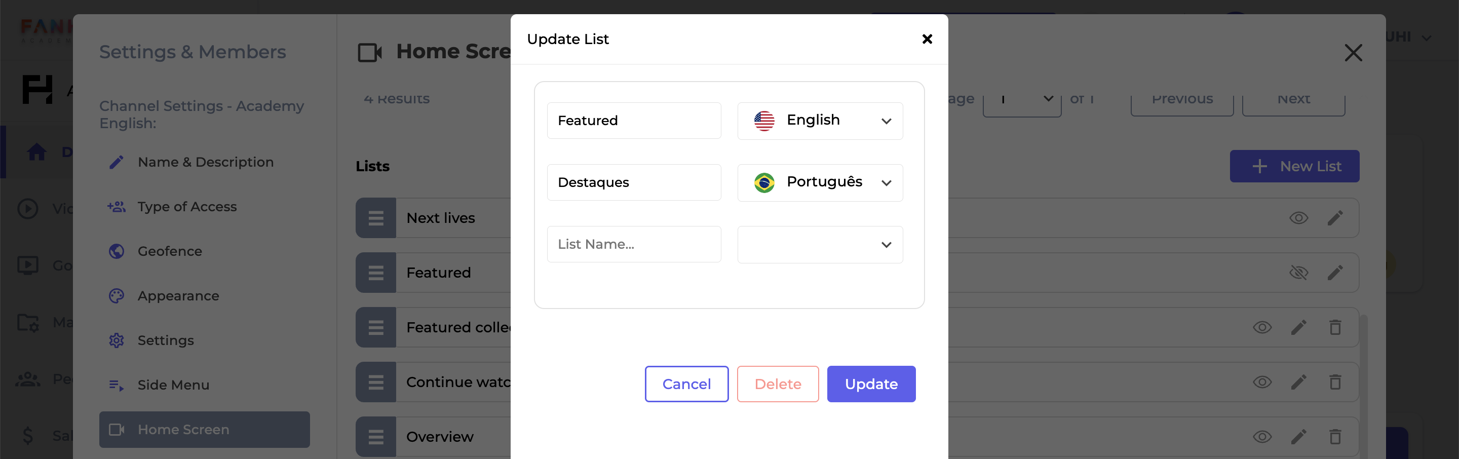
Updating a List
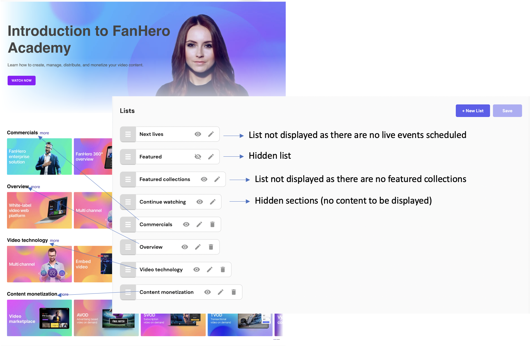
Lists name and order reflected in the Home Screen of the Web Application
Settings
Another feature available in the Home Screen customization is the ability to show or hide Sub-Categories grouped by their respective Categories.
If enabled, the platform will display a list of Sub-Categories thumbnails grouped by their respective parent Category. However, even if this feature is enabled, this section will not display Categories that do not have Sub-Categories. In other words, in order for this section to be visible, a Category must have Sub-Categories.
In the event this feature is enabled, the Sub-Categories will be grouped by their parent Category, and the name of the parent Category will be displayed at the top of the list and the list of the Sub-Category thumbnails will be displayed horizontally immediately below the title of the parent Category.
The vertical order in which the Category and Sub-Category group is displayed is determined by the order of the Categories in the Categories section.
Updated about 1 year ago