Navigation Bar Section
Overview
This is the graphical user interface element that appears at the top of the application screen. It contains links and buttons that allow users to navigate and access different sections or features of the platform.
The Navigation Bar can be customized and branded according to the specific needs and preferences of the Organization. The items displayed change depending on whether the user is logged in or not.
Navigation bar items
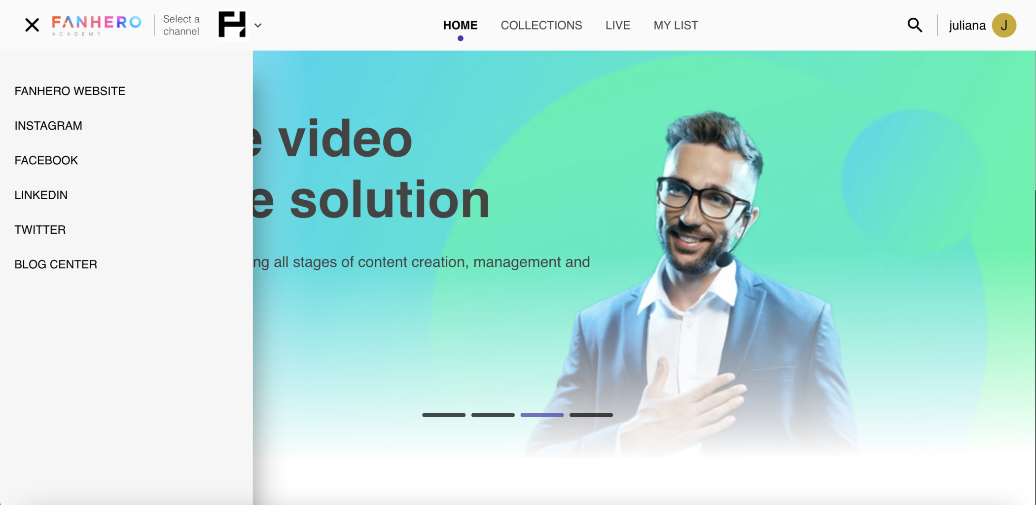
The navigation bar is sized dynamically, which means that depending on the size of the screen, some elements might not be displayed in the bar. If an element doesn't fit, it is available by clicking the three-bar menu in the top-left corner.

Navigation bar for a user who is not logged in
The Navigation Bar elements when a user is logged in are similar to the ones above. The difference is that instead of the Log in and Sign up buttons, the username and avatar are displayed.

Navigation bar for a user who is logged in
Three-bar Menu
The menu contains additional navigation items when the screen size doesn't allow for all the items to fit in the navigation bar.

Responsive navigation bar
It also contains external links that can be added from the Video Portal.
The three-bar menu
Organization Logo
The graphical representation of a specific organization. It serves as a visual identifier for the organization, helping users recognize and associate the platform with a particular entity or company. It is uploaded by the admin from the Video Portal.
Channel Icon
The channel icon refers to the graphical representation of a specific channel within the platform. It is a visual identifier for a particular channel, helping users distinguish and associate content with a specific source.
The channel icon is displayed in a square format and it is visually distinct to differentiate one channel from another.
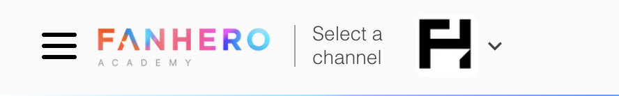
The Channel Icon
Note: If an organization only has 1 channel, then this section will be hidden by default.
Clicking on the arrow will open a dropdown with all channels available in the Organization.
List of channels
Home
Redirects users to the Home Screen.
Collections
Redirects users to the Collections Screen.
Live
Redirects users to the Live Screen.
Feed
Redirects users to the Feed Screen.
My List
Redirects users to the My List Screen.
Search
See Search.
Log in
Redirects users to the Log in Screen.
Sign Up
Redirects users to the Sign up Screen.
Username
The username is displayed when the user is logged in. By default, the username will be displayed but if a "display name" is added by the user at any time, then it has priority to be displayed over the username.
Avatar
Displays the avatar (profile image) the user added (or the first letter of the username if no image was added).
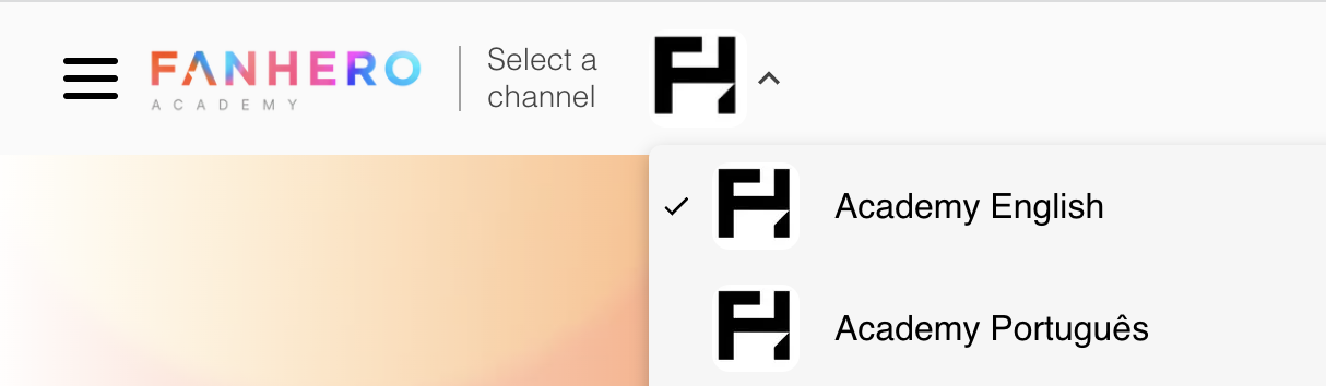
Clicking on the avatar opens a dropdown with the following items:
- Settings: see Settings
- Activate dark mode: enables the dark theme, a user interface design option that uses predominantly dark colors, such as dark gray or black, for the background and UI elements. It provides an alternative color scheme to the traditional light interface, with the aim of reducing eye strain, conserving battery life, and creating a visually pleasing experience in low-light or dark environments.
- Exit: logout
Updated about 1 year ago