My List Screen
Overview
The My List screen refers to the page where users can view and manage a list of their favorite content items. The screen allows users to easily access and revisit content that they have previously enjoyed or found useful.
Users typically add posts and categories to their list by clicking on a dedicated button (plus icon on content cards or My List button on categories billboards). Once added, the content can be easily removed by clicking on the checkmark icon where the plus icon used to be (before the content was marked as favorite).
This is a useful feature for users who regularly consume content on a platform, as it enables them to easily keep track of their favorite content. It can also help to keep users engaged and returning to the platform, as they have a convenient way to access content that they have previously enjoyed.
To access the My List screen, the user clicks My List in the navigation bar at the top of the page.

The navigation bar with the My List tab selected
Favorite Content
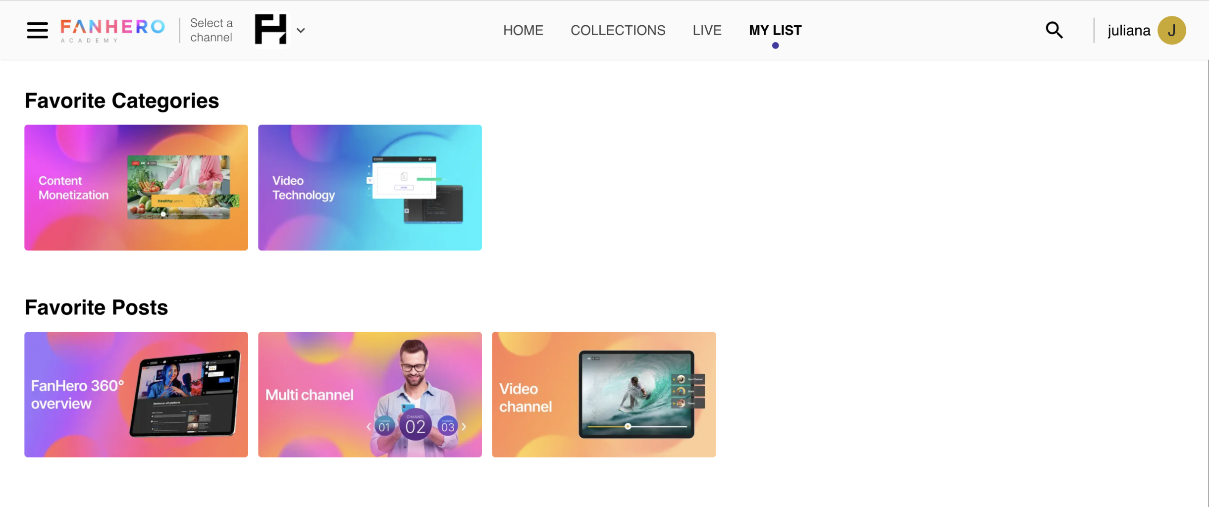
The user's favorite content on the My List page is divided into two sections:
- Favorite Categories
- Favorite Posts
The sections are hidden when there isn't any content marked as favorite.

The My List section
Actions
- Clicking a post takes user to the Post Detail screen.
- Clicking a category takes user to the Category Detail screen.
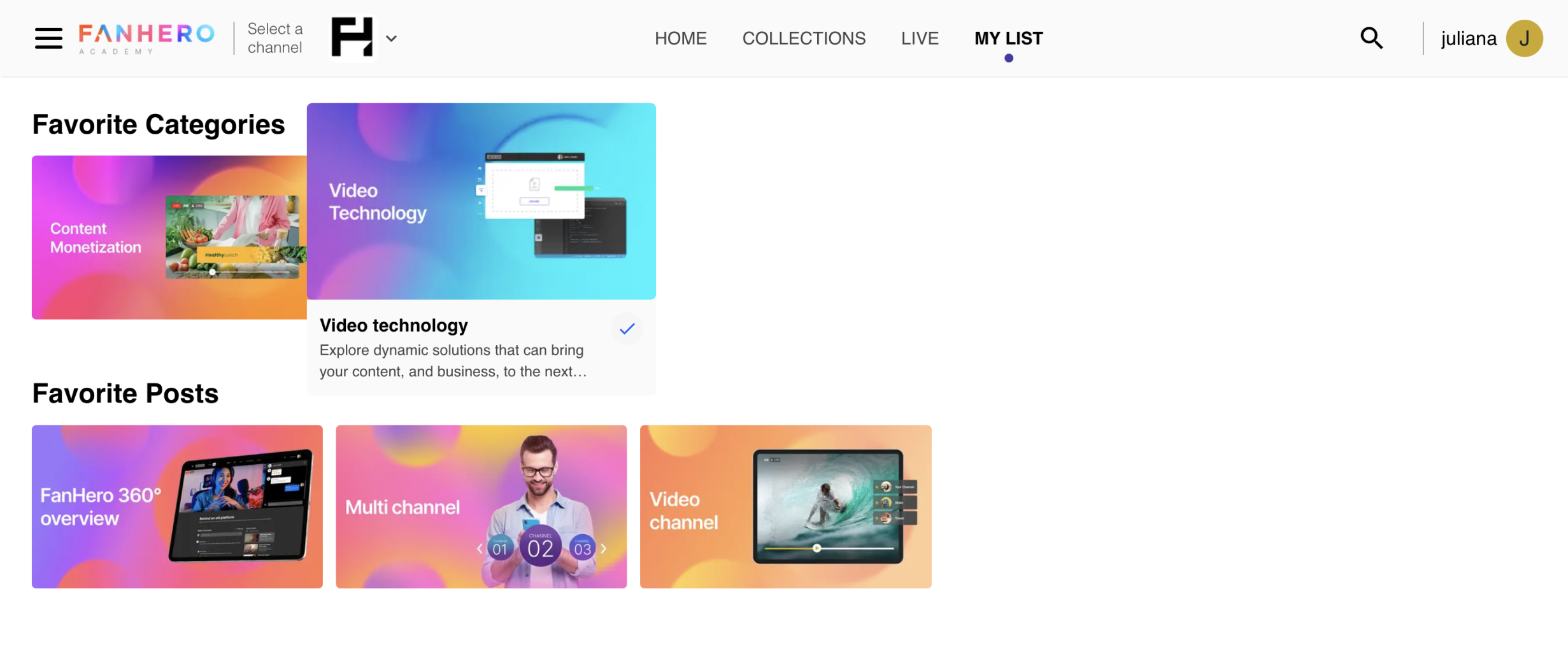
- Clicking the checkmark icon removes the content from the list.

Category card hover
Updated 11 months ago
