Audio Post Detail Screen
Overview
The Audio Post Detail Screen displays detailed information about a specific audio post. This screen is accessed by clicking on a post card. Overall, this is an important screen of the platform, as it allows users to view and interact with individual posts in a more detailed way. It can help to engage users and keep them coming back to the platform for more content.
Audio Player
The component that is designed to play audio content. It allows users to play audio content from their mobile devices.
Audio Player Features
- Play, Pause: Controls to start and pause the audio playback.
- Seek: A slider or control that allows the user to skip forward or backward in the audio.
Picture-in-Picture (PiP)
This feature allows an audio to be displayed in a small window overlayed on top of the application. The PiP window can be moved around the screen, and paused or played independently from the primary application.
To put an audio in PiP mode, simply tap, hold and move the audio player to the bottom of the screen. Once the audio is in PiP mode, you can also move it to the top of the screen.
To open the Audio Post Detail screen again, click the up arrow at the left corner of the PiP screen.
Background Mode
The background mode feature allows audio content to continue playing even when the app is not actively visible on the user's device. This means that users can switch to other apps or lock their device while the audio continues to play in the background. This feature enhances user experience and flexibility, as users can perform other tasks on their device without interrupting their audio playback.
Title and Description
This section displays the title and the description of the Post.
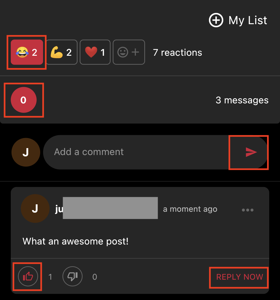
Reactions
This section displays the top 3 reactions the post has plus a smiley emoji where users can add different reactions. Clicking on it opens up a pop up with all available emojis. Any reactions that were already selected by the user will be highlighted using the accent color.
Comments
The component where users can leave comments, share their opinions, ask questions, or engage in a discussion with other users (replies) on a particular piece of content.
- Count of comments: The total number of comments and replies a post has.
- Avatar: Users the first letter of the username.
- Comment field: Where users can type in the comment.
- Username.
- Timestamp: When the comment was added.
- 3 dots: If it's your own comment, then you will see an option to Edit or Delete the comment. If it's a comment from a different user, then you will see an option to Report that comment.
- Comment.
- Upvote and downvote and their respective count.
- Reply now: Button that opens a text field where the user can add a reply to a specific comment.
Available Customizations
- Accent color (one color used throughout the app)
Any changes made to this section require a new build to be submitted to the app stores for approval.
Updated about 1 year ago