Collections Screen
Overview
The Collections Screen is a section of the app where users can view and access various categories of similar content. A category is typically a group of posts that share a common theme, such as a collection of posts on a specific topic.
This screen allows users to easily navigate and browse through the different collections of content that are available on the platform, enhancing their overall experience on the platform.
To access the Collections screen, the user clicks Collections in the navigation bar at the bottom of the screen.

The Collections Screen
Billboard
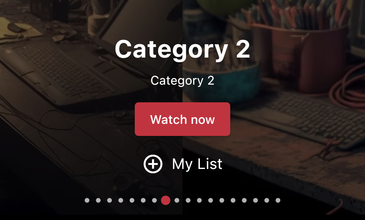
A carousel section that is formed by a banner image, a title, a description and two buttons: Watch Now and My List. Autoplay is on by default and the time interval is set to 5 seconds.
Categories that are marked as Featured by Admin users via Video Portal will be displayed on the Billboard section. This can help users quickly identify which collections are most relevant to their interests and needs.
Item | Description |
|---|---|
Banner image | The Category banner image that is uploaded by the admin in the Video Portal. |
Title | The category title. |
Description | The category description. |
Watch Now button | A button that leads users to that specific Category Details Screen. |
My List button | A button that lets users quickly add the displayed category to their favorite list of content. |
Carousel indicator | Indicates how many slides are available in the carousel. Uses the indicator color of the Channel. Clicking on one of the rectangles takes user to that position of the billboard carousel. |
More Categories
This section with infinite scroll lists all single-level categories, which refers to a classification system where content items are organized into one level of categories, with no subcategories beneath them.
Actions
- Clicking on the "i" icon opens a pop up with additional information about the Category.
- Clicking on a thumbnail takes user to that specific Category Detail screen.
Collections
Below the More Categories section, all Multi-level categories will be displayed, each one with its subcategories, containing the name of the parent category followed by the thumbnail of the subcategories assigned to that category.
Multi-level category systems (hierarchical category systems) are classification systems where content items are organized into multiple levels of categories or subcategories. Each category can have one or more subcategories beneath it, and each subcategory can have further subcategories beneath it, forming a tree-like structure.
Actions
- Clicking on the "i" icon opens a pop up with additional information about the Subcategory.
- Clicking on a thumbnail takes user to that specific Subcategory Detail screen.
- Clicking on the view all link redirects user to the Parent Category Detail screen.
Categories Accessibility Settings
Each Category or Subcategory can have its own accessibility setting:
- Public and Exclusive Category (or Subcategory) - no further action is required from users at this point since they are already logged in.
- Password Required - the user must enter a password to gain access.
- Paywall - if the user has already purchased the product associated with the Category (or Subcategory), then the Category will be open (same as Public and Exclusive Categories). If the user has not purchased the product associated with the Category yet, then a message will be displayed saying that it is a premium content that cannot be acquired through the mobile app.
Available Customizations
- Accent color (one color used throughout the app)


Any changes made to this section require a new build to be submitted to the app stores for approval.
Updated 11 months ago
